PORTFOLIO - minnesota deed
Building a more usable unemployment insurance platform
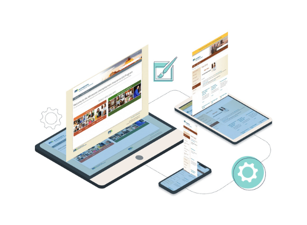
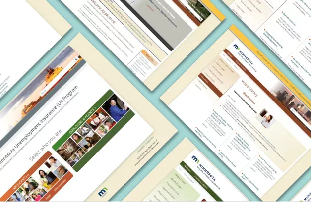
High Monkey partnered with Minnesota DEED to redesign UIMN.org, ensuring an intuitive, accessible, and supportive experience for both unemployment benefit applicants and employers.
Minnesota DEED | Launched 2025
About the client

The Minnesota Department of Employment and Economic Development (DEED) is the state’s principal agency for workforce development, providing vital resources for job seekers, businesses, and communities. UIMN.org serves as the primary portal for Minnesotans applying for Unemployment Insurance (UI) benefits and for employers managing UI-related tasks.
Annual Visitors: 250,000+ | Service: Temporary partial wage replacement


The challenge
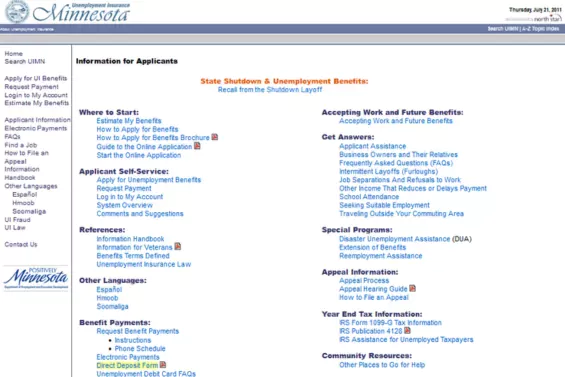
DEED sought to enhance the UIMN.org website to better serve Minnesotans navigating unemployment. The redesign focused on usability, content accessibility, and process clarity, ensuring that both job seekers and employers could easily find and understand critical information.
Key requirements
- UX testing– Conducted real-user testing with recently laid-off individuals to refine the site’s ease of use.
- Content consolidation – Simplified and reorganized complex UI information to enhance accessibility.
- Infographic-based Navigation – Transformed complicated processes into clear, visual guides for easier comprehension.
- Accessibility & Compliance – Ensured the website met ADA compliance and was fully optimized for mobile and desktop users.

Our approach
High Monkey worked closely with Minnesota DEED to develop a highly intuitive, accessible, and user-first digital platform that instills clarity and confidence in users navigating the UI process.

User-centered design & testing
Conducted usability testing with recently laid-off individuals to gain real-time feedback on pain points. We prioritized clarity and ease of navigation to reduce user stress during an already difficult time.

Content strategy & simplification
Reorganized UI information to be clear, digestible, and structured for different user types (job seekers vs. employers). We also balanced legal and procedural accuracy with a conversational, easy-to-understand content style.

Visual process simplification
Converted complex, text-heavy UI processes into infographic-based workflows, helping users understand next steps at a glance.

ADA compliance & accessibility
Designed the platform using best practices in accessibility, ensuring the site was fully ADA compliant. We also optimized for mobile usability, allowing users to navigate the UI process on any device.
Results and impact
The redesigned UIMN.org website successfully delivered a clearer, more accessible experience, helping both job seekers and employers navigate unemployment processes with confidence.
Key outcomes
- Optimized user experience – A streamlined navigation structure and intuitive interface make it easy for users to find leadership tools, research, and events.
- Key infographic implementation – Transformed complicated processes into clear, visual guides for easier comprehension.
- Improved content accessibility – Built on Kentico 13 MVC, the site ensures quicker load times, improved responsiveness, and long-term scalability.
- Enhanced search & mobile optimization – Wiley’s team can now efficiently update content, manage events, and maintain resources without technical roadblocks..


When confronting difficult SharePoint challenges, we usually ask ourselves – or each other, “What would High Monkey Do?” I know that sounds a bit silly, but it really works. We appreciate the guidance and wisdom you have given us over the years – and you know we still call you with the really tough questions.

SARA R.
Technology Director

Your success story starts here
Contact us for a free consultation, and let’s work together to build a strategic plan that tackles your challenges and lifts your organization to a new level.